Web and social
A part of my job as Senior Designer at American City Business Journals is producing digital and social assets for the weekly cover stories, adapted from the print version. Typography and the nameplates are the brand identifier for these examples. The design style is based off of the story we are telling.
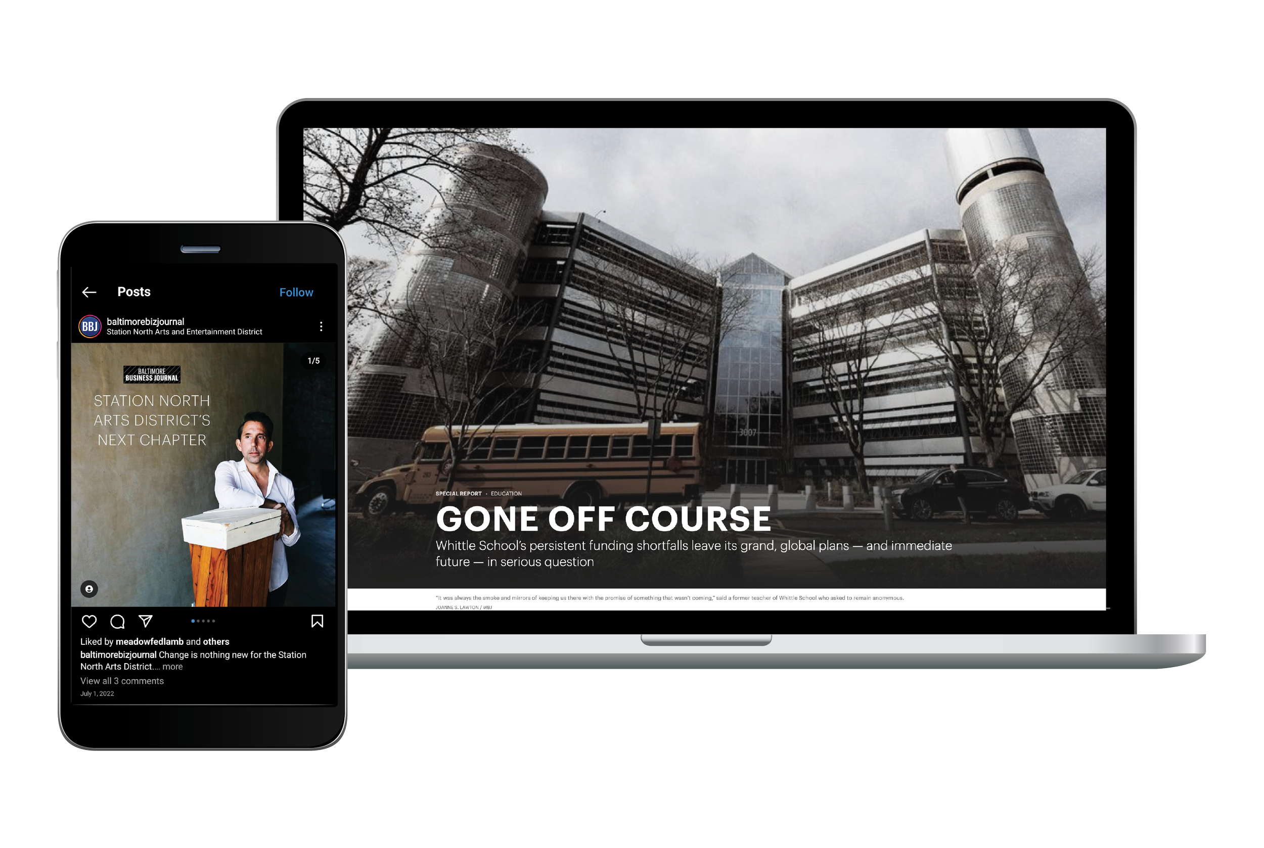
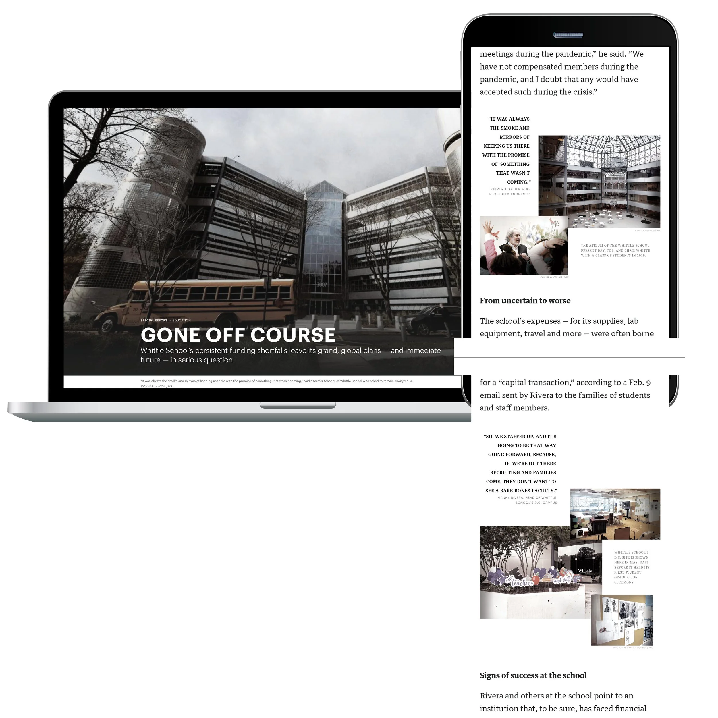
Gone off course
This story had to be visually simplified, since the subject was about an on-going legal battle between the school’s founder and the building’s landlord. We could not get updated photos of either the school or the founder, but decided that a combination of pull quotes paired with archived photos were the best way to visually take readers through the story.
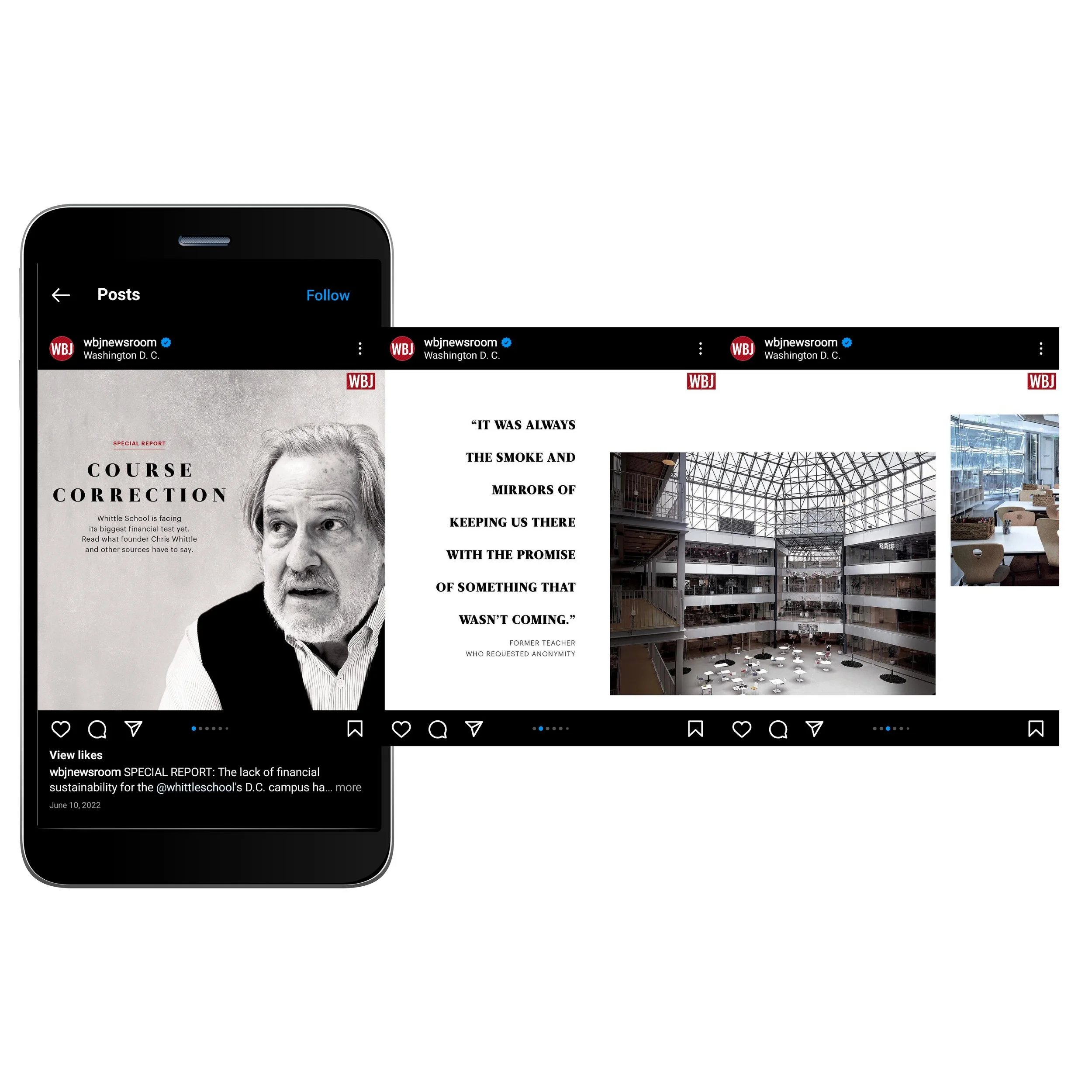
Course correction
Mirroring the design of the article, “Gone off course,” the Instagram post consists of toned photos and quotes from the story. The purpose of the slide post is to take the audience through the story in a way that almost mimics a timeline of pull quotes.
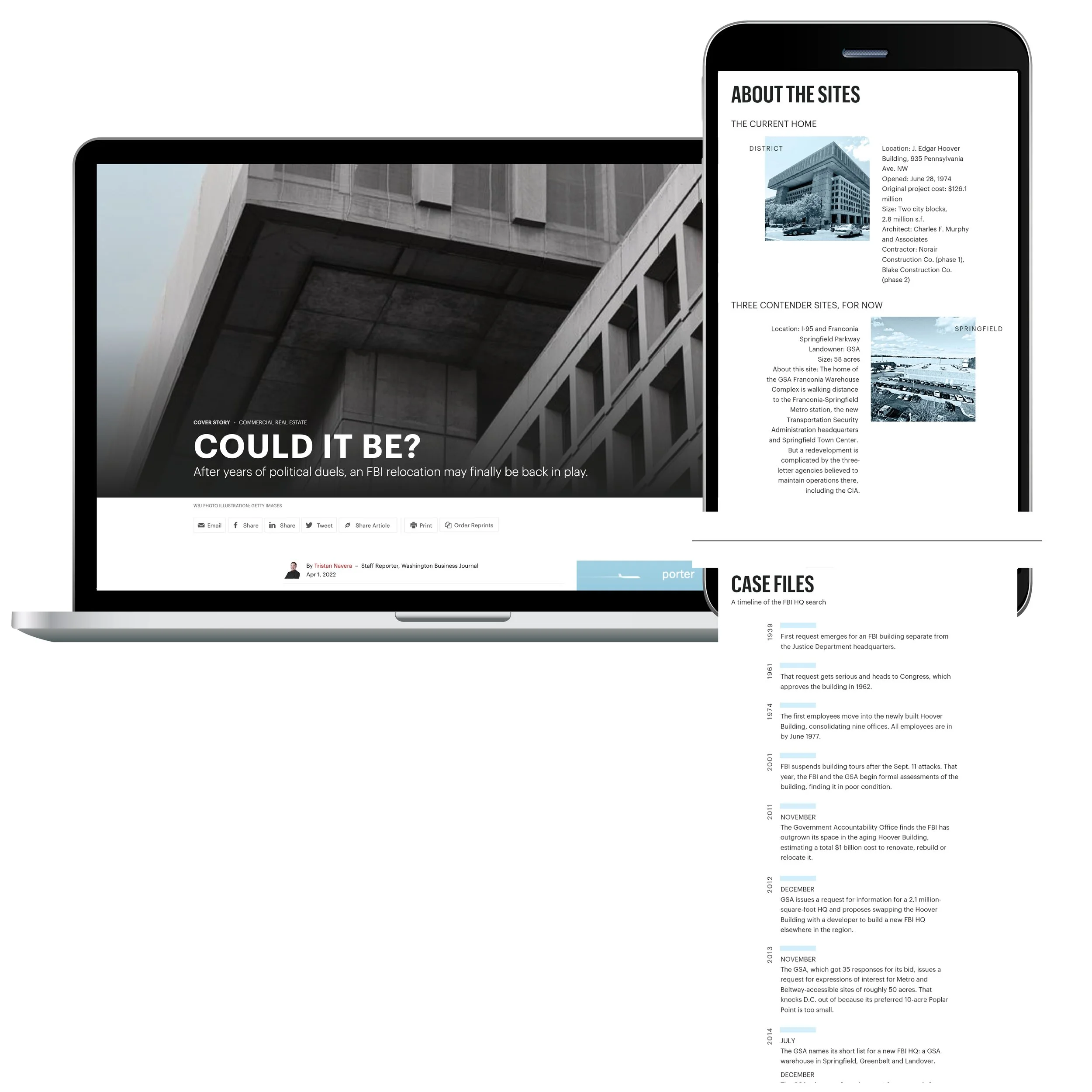
Could it be?
After years of searching for a new FBI headquarters, the search is… not over. The stale brutalist architecture is contrasted with unconventional brutalist design elements within the article. The building itself is iconic, so the photo crop plays with the image to accentuate both brutalist styles.
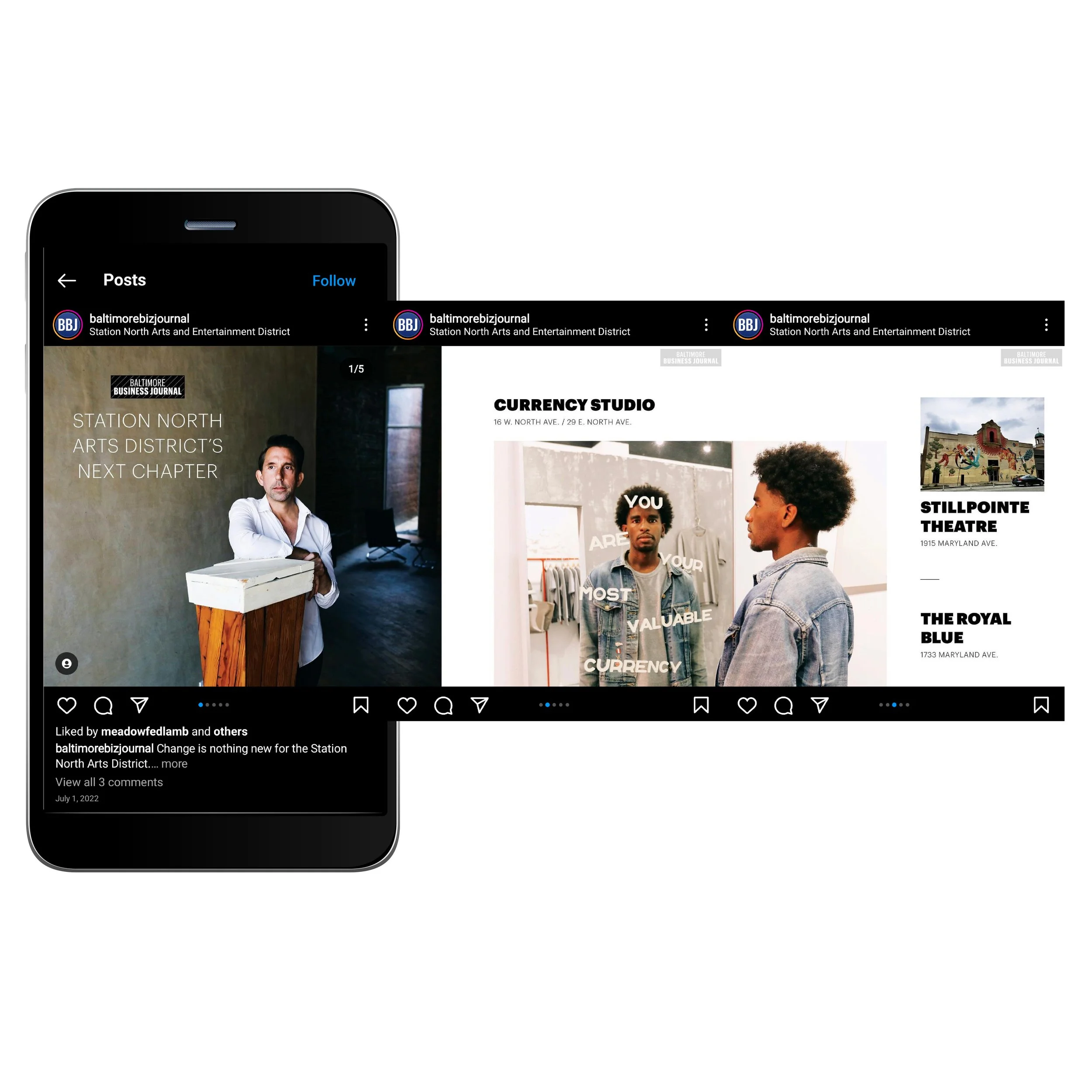
Station North
This post highlights the new businesses that opened in Baltimore’s Station North Arts District. The purpose of using photos is to showcase the different locations in a creative format, while still giving an address and tagging each business to give the audience options to explore.